
Best Practice for 2021 that You Need to Know
 It’s March! Amazing that we are already into the third month of 2021. I, personally, am taking full advantage of the brilliant morning sun as I write this post – sitting at the big kitchen window, my lady liberty coffee reaching the depths of my post-Winter, hurry-up-Spring soul (even the birds are at the feeders this morning in full swing!).
We’ve finally reached that time of the year when Spring Cleaning comes into full effect, not only in our homes, basements and closets, but it’s a great time for business teams to place their website into the same routine.
A few years back, we did a great article on some of the basics of Spring Cleaning for your website (include old post link, external window). This year is no different, except we want to spend a little more time looking at the lense through which you view your website. Just because the general lifespan of a website is approximately 2-3 years, it doesn’t mean that you shouldn’t keep an eye on your website to ensure that it is giving you the best performance possible in between rebuilds.
In this article (and through our weekly social media reminders (include link to Facebook page), we’ll walk you through some of the key points to keep you, and your site, on track and prepped for the next year.

Week 1: Minimize Text, Maximize Visuals
- Minimize lengthy text, but make sure it is properly written to optimize what you are selling/saying for optimization (using a professional copywriter for this is always great because their job is to keep an eye on your competitors too – how does your website text rank against theirs from an optimization and user interaction perspective)
- Using visual images and or infographics help to break up your content pages and make the context clearer and easy for your users to understand; professional images (use stock is necessary), pictures with people (versus just generic icons or scenery), and ensure that the images are well appointed to balance with your text so that the user is not visually over-whelmed
- Try shorter paragraphs, and primary/secondary title formats and leave lots of white space between items; using the “rule of thirds” here is a great tip – balance, balance, balance

Week 2: Brand Consistency
- It’s important that your brand is easily recognized and understood to all new and existing clients; logos should be crisp and clear to read, ensuring that you are using the right contrast for your backgrounds (hint: inverse your whites and blacks as necessary); having a Brand Standards Guide can really remove the guesswork from this process
- Your colours and fonts should be the same in all brand materials, from your website to your social media marketing ads, your email signatures where possible, etc
- Avoid using hard-to-read fonts on your website – all important information should be readable. Sloop and script fonts, or sarif fonts (with accents) can sometimes become too thin or difficult to read (try using a sarif for larger titles, but a sans–sarif for body text)

Week 3: Simplify Your Menu Options
- Use your menu to highlight the most important pieces of your sales process and customer experience (don’t forget to have your contact information visible at all times at the top of your site!)
- Order is important! Your first button should be HOME and the rest should be listed in the order of importance, for example: Home, Services, Quality Assurance, Testimonials, etc; when Google is indexing your site, it uses your site map to sort your content, so for this reason, you should generally list your services before your team information
- Use your Footer menu for secondary page links, like careers, galleries, privacy policy, site map
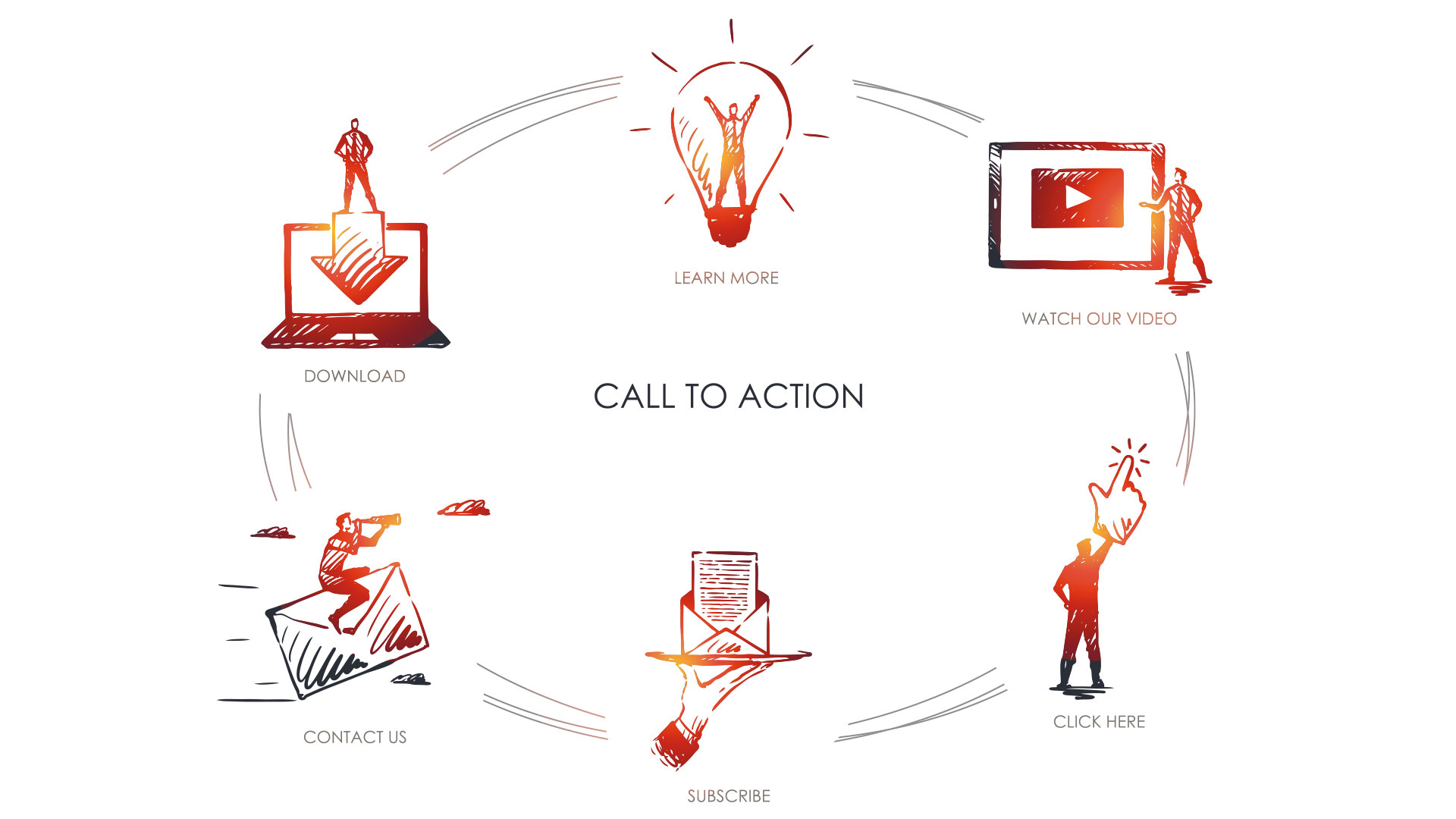
Week 4: Calls to Action (CTAs) Do’s and Don’ts
- Your CTAs should be consistent on every page – the same colour, style and verbiage so that the user is given an easy and familiar experience when trying to access you; use the idea of familiarity to your advantage
- Always include CTAs at the top portion of your website, near or around your logo and main menu, and wherever you have made a reason for a client to choose you over the competition (testimonials, service descriptions, etc)
- CTA suggestions include: “Check Out Now”, “Get a free Quote”, or something as easy as “Email Us” or “Click to Call”; value-add propositions are great too, like “take 10% off now”

Week 5: Analyze to Optimize!
- Add properly written page meta data to your important web pages
- Watch your site loading speed and optimize your site files and development often to keep it from being bogged down (I.e. cleaning your media library, annual site maintenance and updates, etc); a VERY important piece is to optimize your mobile website pages – for simpler sites, you can use your standard pages, but for more complex websites, consider using a separate mobile menu with simplified pages
- Test, test, test your website changes for desktop, tablet and mobile to ensure everything looks and functions as it should on all devices
So now that you’re ready to roll up those sleeves and dig into the dusty cobwebs of your website closet (see what I did there? Lol… somewhere, my husband is rolling his eyes lol), let us help! We just happen to be EXPERTS at this, and we’re offering FREE Website Audits during the month of March to all existing clients. Ask us for more details!
Happy Spring Cleaning!!
~ Jenni